The Label Design Process

Imagine if your favorite artist was reduced to a canvas 5” x 8” in size. Then subtract from that, more space, that is taken up with governmental warnings and other required information as well as a barcode. Would they be able to design an eye-catching label that was both pretty and functional?
To get answers to that question, I e-mailed with beer writer, brand designer and beer label designer Kelly Erickson, co-owner of Craft Media Solutions in Los Angeles, on how the whole process works up to the point where that first label is stuck to the can or glued to the bottle.
BEER PAPER: How does the process of designing a label work with a brewery? How much leeway do you have? What is the back and forth like?
ERICKSON: We dedicate a considerable amount of time to brand discovery when we first start working with a client. Like most small businesses, not many breweries have the resources to develop brand strategy when they first get started, so we often find that they are thinking about the larger picture of their brand for the first time. We talk about the company’s core values and ethos and how they would like to be visually represented, but also how they would like the customer to experience their product or brand. Once we’ve established the brand roadmap, we start talking details about each label – sometimes even participating in the brainstorming of the beer names themselves.
In the design process, I really take my time creating multiple concepts that are as complete as possible and that provide vastly different options to choose from. The amount of creative license I have for each label really depends on the brewery – I have one client that has a pre-determined template and style, and another that is more interested in more wild, out-of-the-box designs. Sometimes I knock it out of the park in the first round of concepts, and others require multiple revisions before getting approval. So, it depends on the client and my level of design inspiration! I try to tap into their mindset but also keep in mind that the customer experience is very important if they want the product to sell. With how competitive shelf space is, and the amount of visual noise you see in the IPA section, achieving brand vs. consumer purchase behavior is our biggest challenge.
BEER PAPER: What information do you get before you start working on a label?
ERICKSON: In addition to those overall brand elements, I make sure we are on the same page with the overall “look and feel” or theme of the product. For instance, there is a new series of Dry River Brewing bottles coming out that feature photographs of parts of the LA River (which has been part of the brand story since the beginning) but are more architectural focused than what they had previously done. They want to tell a story of this urban river and a stark contrast between concrete and nature. It’s a very different style of art from what I’ve been doing for LA Ale Works, which are 16oz.cans but they also have a brand style that’s more illustration-driven; so from them I get the beer name and style, and maybe an example of what they like before I start on the concepts.
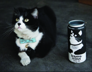
Photo Credit: Kelly Erickson
BEER PAPER: What do beer consumers NOT know about the difficulty in designing for a consumer product?
ERICKSON: You have to think three-dimensionally when designing a product like beer labels – and that can be challenging! I make sure to print out my concepts and make physical mockups to ensure each line of text or graphical element is where it needs to be. I even take those mockups to a local beer store, put them on the shelf and make sure I like how it sits. You want to make sure important design elements (like important text – ABV, etc) aren’t being covered up by a shelf or price tag holder, and that the colors or layout stand out next to competitors.
There are also so many legal details you have to include when designing consumer products – something I learned about in my first graphic design job many, many years ago producing private labels for a grocery store chain. If you want to get label approval, you have to consider font sizes, legibility and other required statements including brewery location, alcohol warnings, fluid ounces, etc. You’d be surprised at how many breweries forget to put these required items on their packaging, some even forget to put on a UPC code.
Preparing files for press is also quite challenging, particularly if you’re doing custom print jobs with spot UV or foil stamping. I was just working on a piece that has multiple layers of opaque white elements in the background, so that some of the printing on the label looks clear (so you see the can shining through) and other elements have different gradients of color with a bit of metallic from the can. It’s hard to explain but even harder to picture when you have this layered Illustrator file in front of you. But methods like that end up producing a unique label that stands out on the shelf but doesn’t require expensive printing processes.
You also have to send these labels in about 3-4 weeks in advance, so it does take a lot of preparation and planning to make sure the beer release aligns with your printer’s schedules.
BEER PAPER: Do you prefer a can or bottle? And do you like a 12 oz or a 16oz?
ERICKSON: Depends on the style! Sours typically sell better in bottles, while the lagers and ales tend to do better packaged in cans. I prefer 12oz cans when I’m drinking alone, but 16oz cans have so much more room to play with when I’m designing them.
BEER PAPER: Any Easter Eggs planted in the artwork?
ERICKSON: A while back I was watching (for the second time) the Netflix documentary about the Fyre Festival when I texted Kip of LA Ale Works about doing a label for it since it was such a huge part of the zeitgeist at the time. As a result, Orange Crushed Dreams was born, with a label that mimicked the orange tile (that was used by the festival in a viral marketing attempt) and it looked just like as screen capture of an Instagram post. The LA Ale Works team actually created an Instagram account that was printed on the label called @pabloescobarsisland and was posting on that account using similar imagery used by Fyre Festival. It was probably the most fun can release marketing I participated in – even if it didn’t go crazy viral!
As for the rest of the labels I produce, they pretty much all have a story behind them whether it’s a throwback from my childhood or an experience of my clients. I’m trying not to be too gimmicky but I’m also not ashamed if one or two slips through.
BEER PAPER: What label(s) would you like to “re-design” or “re-think”?
ERICKSON: There are so many great labels out there BUT I’d love to have a crack at any label that portrays women or people of color in misogynistic or racist ways. I would like to see more labels celebrating women not as objects but in positions of success and celebration and power, or as just a person. For instance, Bottle Logic’s Recursion IPA label portrays a female scientist who is not over-sexualized and is just one example of how you can put women on your label without objectifying them. It’s not that hard!
BEER PAPER: What labels have you done and what do you have coming?
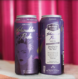
ERICKSON: While I’m excited to start pitching some collaborations with other breweries around Southern California and beyond, I have a couple of clients I’m doing consistent work with. Scrappalicious Juicy IPA just came out of LA Ale Works, which features a custom illustration of their brewery cat Scrappy. I’m looking forward to seeing a new version of the Sum Sum label, a summer ale with a very summery vibe in the design. We had some really great success with Shoulder Pads last year – a very purple, 90s inspired theme I did for the Pink Boots brew. This year’s Shoulder Pads has a slightly different design, which I’ll tweak each year but maintain the same overall concept. Lastly, new Dry River’s bottles should be hitting the shelves soon and I really recommend grabbing some of those – the Saison (called Ex Materia) is really tasting amazing!
Sean Inman has been writing about craft beer in Los Angeles since 2009. His daily beer posts are on the Beer Search Party blog. He also writes a monthly beer column for Food GPS.


